本文的两个topic,其中有画图作业。其一为美国高等教育和澳大利亚高等教育价格下降的原因。
第二个为:解释非法和合法药物为何会成为价格缺乏弹性的例子和原因。两个作业都有画图要求
|
|
Rebecca’s sample assignment
Assignment topic Question 1In analysing the three examples I will use the four-step approach outlined in the study book for Introductory Microeconomics.
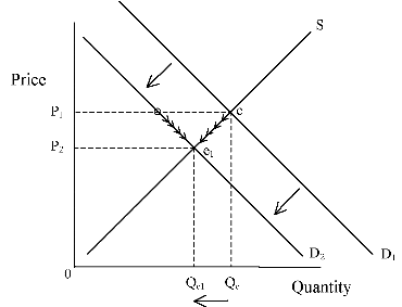
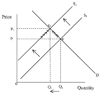
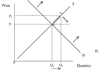
(a) Analyse the impact on the market for Australian tertiary education of a decrease in the price of tertiary education in the United States. In analysing the market for Australian tertiary education, the demand curve would be affected because the fees in the United States of America were going down and the law of demand states a decrease in price will lead to an increase in quantity demanded. Relative to the United States, Australia’s tertiary education is now more expensive; therefore there will be less demand for tertiary places in Australia. Students will choose to go to the United States instead. This factor was exogenous, outside the Australian model. The lower price in the United States does did not appear on either of the axes. This means a shift of the demand curve to the left, towards the origin, as the quantity demanded has decreased. The new demand curve (D2) now shows that at the old equilibrium price at point Z, the quantity demanded is actually Q3. At this same price the quantity demanded before the shift was at Qb. As the diagram shows there is now too much supplied, excess supply as at this price. To adjust to the new equilibrium, there must be an adjustment along both the demand and supply curves. Both curves will have movements along them. The supply curve will have a downward movement along the supply curve meaning less is being supplied at the lower price. As the price falls the quantity demanded will increase until the market reaches a new equilibrium between demand and supply at Q1 and P2 where there is no further tendency to change. Graph 1: Market for Australian Tertiary Education (b) Analyse the impact on the market for electricity of new regulations requiring the installation of pollution reduction equipment by all electricity producers. In analysing the market for electricity I found that the supply curve would be affected because there would be an increase in supply as there is a new product on the market and everybody would want it. The law of supply states that an increase in quantity demanded would increase the price of the product and therefore less will be demanded at the new price. This factor is exogenous as it did not appear in either of the axes and affects both demand and supply curves. It would then shift the supply curve right, or away from the origin, as the supply has increased. The new supply curve now intersects at the old equilibrium price at point W; at this point the quantity supplied is Q3. This shows the excess demand, as at this price there is more supplied than there is demanded. To adjust the curves so that they are at equilibrium, both curves will have movements along them. The supply curve will have an upward movement along the curve because more is being supplied at the higher price. As the price is increasing the quantity demanded will decrease until the market reaches a new equilibrium between Qh and Pz where there is no further tendency to change. Graph 2: Market for Electricity (c) Analyse the impact on the market for tea of new medical research linking tea drinkers to lower rates of cancer. In analysing the market for tea the new medicinal characteristics would cause an increase in the amount of people drinking and buying tea, so therefore the demand curve would be affected. The increase in demand would shift the demand curve to the right, a shift away from the origin. The new demand curve (D2) at the old equilibrium price at point F, has the quantity demanded as Q3. At this same price the quantity demanded before the shift was Qc. This shows that at the old price too much is demanded, while not enough is being supplied. There is excess demand. For the market to adjust so that both demand and supply are at equilibrium, there must be a movement along both demand and supply curves. The supply curve will have an upward movement along the curve because more will be supplied at the higher price. As the price increases the quantity demanded decreases until the market reaches a new equilibrium between Qx and Pr where there is no further tendency to change. Graph 3: Market for Tea Assignment topic Question 2Both illicit and legal drugs are often cited as the classic example of goods which are very price inelastic.
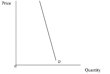
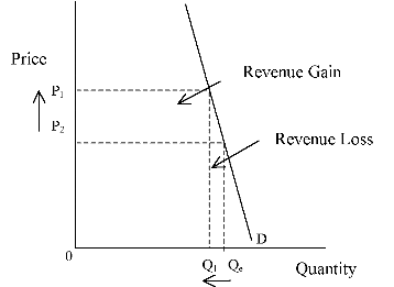
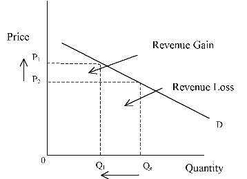
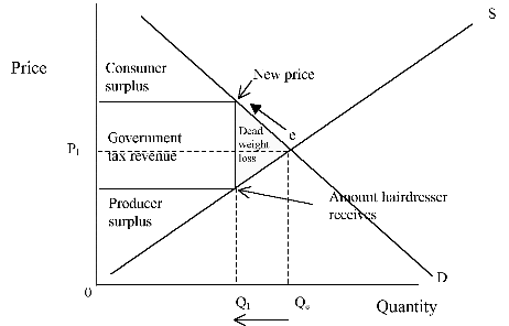
Elasticity is a measure of the responsiveness of quantity supplied to one of its determinants (Gans, King and Mankiw, 1999, page 88). Illicit and legal drugs can be classed as both elastic and inelastic products because for some there can be close substitutes found. Therefore they are not needed as much and people are not dependent on just the one particular product. With inelastic products, when the price changes dramatically there is not a large decrease in the quantity demanded. This shows that people who are dependent on this product have no choice, and therefore will pay a higher price for it. These products will always be demanded. People become addicted to drugs or need them for medical reasons and therefore they will always demand them. This means that distributors and sellers can raise their prices and people will still buy them, there will not be a dramatic decrease in consumers if there is a sudden price increase. This shows the product is inelastic because it is may be addictive or always demanded for health reasons. It is something that people have to have so they can live, and therefore prices can increase, as quantity levels of consumers will not decrease dramatically. Graph 4: Inelastic Demand Curve The inelastic demand curve is very similar to a straight line, because of the curve’s almost vertical appearance. It shows that quantity levels will only decrease by a little when price increases quite dramatically. The two points I have drawn on the curve show this. Even when I made one dot quite a lot higher than the other the quantity demanded didn’t decrease dramatically. Graph 5: Inelastic Demand Curve Graph 6: Elastic Demand Curve By colouring in the difference between the two dots and the vertical and horizontal axis, you can see the revenue gain is larger than the revenue loss (as drawn on the diagram). Whereas the other diagram is the elastic demand curve, and it shows the same two points with similar dramatic price increases. The price increases however, show a large drop in the quantity levels. Again, when you shade in the required areas you can see that with the same price increase the revenue loss wedge is larger than the revenue gain. This then explains that with a dramatic price increase inelastic companies still make a profit. By showing the two diagrams I have attempted to show that the elastic demand curve does not have the same responses as the inelastic when it comes to price increases, and that the products which are inelastic can absorb slight price increases and will not lose a lot of their consumers. Inelastic demand products are different from other products on the market. Usually when a products price increases consumers may change brands or find a substitute product, and this is a way that product prices are kept reasonable, as long as all the products don’t go up all at once. This is because these products rely on their demand to maintain their profit. Inelastic products however are not the same, they do not keep customers because their prices are low, or because it is a well-known brand name. Pharmaceutical companies known that their market is dependent on their products and therefore they can raise their prices. These are a product without which the consumer would not be able to survive, that is why when there is a dramatic price increase there is not the same decrease in quantity demand. For example the price of cigarettes has recently risen but this has not encouraged many smokers to quit, this is because they are addicted and can’t stop therefore they are willing to pay the higher price for their nicotine fix. Assignment topic Question 3:Australia’s taxation system will change on July 1 next year to include a broad based Goods and Services Tax (GST), which will be added to the price of most goods and services purchased by consumers. A hair cut is currently untaxed in Australia. (a) Use a demand and supply diagram to show the impact of the GST on prices and output in the Australian hair cutting industry. (Actual prices and quantities are not required). (b) Identify and explain the areas of consumer surplus, producer surplus and government tax revenue. In doing so, comment on whether the burden of tax falls only on consumers. (c) Use your diagram and the concept of deadweight loss to predict the overall effect on welfare as a result of the GST on haircuts. (d) Part of the new tax package is a reduction in income tax rates. Knowing that taxes change economic incentives explain why the broader based GST tax system may be preferable to the current system of progressive income taxes. Graph 7: Australian Haircut Industry – Introduction of GST With the new taxation laws introduced in July there is now going to be taxes on products that never had taxes before, hairdressing is one of these. With this there will be an increase in the price to have your haircut (shown by the arrows, and the dot for new price). Although the price has increased, the amount that the hairdresser receives has decreased (amount received shown on diagram). The area between this is the tax wedge, or the government tax revenue. The government tax revenue is the amount that the hairdresser will have to pay the government for every hair cut, and then they will redistribute to the public. Tax burden falls on both the producer and the consumer; this is shown because the wedge has taken an even share from both sides of the equilibrium line. Consumer and producer surplus are both labelled on the diagram. Consumer surplus is found above the equilibrium line, and is the area or surplus of what consumers have to pay and what they are willing to pay. That is why it is above the equilibrium because that is the level they have to pay and the space above this line and the demand curve is the surplus. Producer surplus is the area from the equilibrium point and down until it hits the horizontal axis. This is the surplus of what the producers were willing to sell the product for and what they are selling it for. Dead weight loss is another area labelled on the diagram. This is the area where the consumers were willing to pay this price, but the producer could not supply it at that price now that tax has been introduced. This now means people have to pay more for a haircut and that a hairdresser does not receive as much revenue from each cut because they have to pay tax. The reduction in consumer and producer surplus is bad for welfare, but the tax revenue is good because then the money can be redistributed to the public, so the dead weight loss can have both a bad and good outcome. The new tax package is broad and with the introduction of the higher income taxes it is going to give consumers more of an incentive to buy items as they have more money in their pockets. But this may not be the case, as the new tax regulations mean that items that never use to be taxed are, and previously taxed items will increase in price. When the new tax regulations are introduced this may, at the beginning, reduce the demand for some products, but these producers may not be able to lower prices as they now have to pay a tax, therefore the dead weight loss may grow in size. Producers may have to reduce the levels they supply because they may not be able to pay the tax, or buy the raw materials now that they have gone up in price. Although there may seem to be a large amount of problems with the new tax laws, they will end up making all producers even and will not disadvantage some trades as the previous law may have. |
如果您想找美国assignment代写的机构,我相信Bonrun是您最佳的选择。Bonrun的写手超过300名,涵盖了大多数代写科目,而且Bonrun始终支持担保交易 100%通过再付款,免费售后是您代写的理想伙伴!




Assignment topic Question 1:
This question relates to content and skills covered in Week 2 of the Subject Guide, Chapter 4 Gans, King, Mankiw.
Use the four steps from Week 2 of the Subject Guide to answer the following questions.
Draw a separate diagram for each event and refer to points on the diagram in your explanation.
[10 marks]
[10 marks]
[10 marks]
Word Limit 750
Assignment topic Question 2:
Both illicit and legal drugs are often cited as the classic example of goods which are very price inelastic.